DUMFRIES & Galloway Life is a monthly magazine that, four years ago, was named Magazine of the Year at the Scottish Magazine Awards, run by the Professional Publishers Association (PPA).
The magazine’s commissioning editor is Andrea Thompson and it is published by the CN Group. A new look was launched for the August issue, designed by Linlithgow-based magazine designer, Matthew Ball, who answers the questions, here…
What exactly was the brief?
I joined PPA Scotland earlier this year and almost immediately I got a call from Richard Eccles, the publishing director of CN magazines. He had been let down by a designer and was looking for a someone to redesign his portfolio of magazines, which includes Dumfries & Galloway Life.
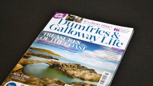 I had previously worked on another CN title, Cumbria Life. And on this occasion, the redesign required was much less radical. Dumfries & Galloway Life has a deliberately broader audience than Cumbria Life. The brief was to make the current approach and content work better for the reader, by rolling out a new look and logo.
What first struck you about the job?
The quality of the magazine. A lot of regional titles don’t stand up against national titles but the photography and the writing in Dumfries & Galloway Life is superb.
 The team understand, and are engaged by, the community they serve. Commissioning editor, Andrea Thompson, spends a great deal of time in the community and knows what makes her readers tick.
Describe the process from conception to completion
I wanted to make the photography central to the redesign. Its staff photographers, Phil Rigby and Jenny Woolgar, shoot everything, from portraits and still life to landscape and action shots.
 They are incredibly broad in their skills; their work is central to making the magazine’s visuals sing.
There’s also a great team of freelance photographers used by the magazine from across the region – the likes of landscape photographer, Allan Devlin, who provides words and pictures every month, for the walking features; wildlife expert and countryside ranger, Keith Kirk, who provides words and copy for wildlife features. Others – Gordon Rae, Peter Foster, David Moses, Louise Llewellyn and Brian Kerr – are all excellent and they have all shot front covers for the magazine in the past.
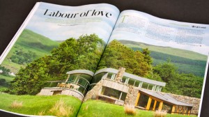
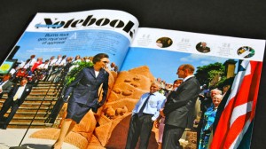
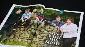
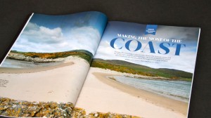
More care is taken with photo editing, so fewer images are used to tell a story – but they’re bigger. You can’t help build ‘flick-stopping’ pages with such dramatic photographs of the county and its people.
The use of photography influenced the grid and the structure of the magazine. The new chassis has better pacing and announced the sections more clearly. The typography is simple, with strict meaning to what each style represents.
The redesign had to fit in with the busy schedule; the production team of Sara Valentin, Lindsay Molloy and Alison Turnbull produce two other titles, so the I worked around their timetable.
 Since the editorial team are going to be using the templates for the next few years, it was essential they were included in the decision-making process. Had they not been happy with the new look, it would have been tricky to pull it off.
Pantone numbers, fonts, use of space, kit, etc?
Dumfries & Galloway Life is an A4 glossy magazine, running to between 148 and 180 pages. The main colour is a deep blue (with a nod to Scotland) with six or seven other colours used as a support. The back and the front of the magazine is colour-coded, with the features reflecting the content.
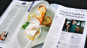 The core type faces are Acta and Soho. Acta is a comprehensive serif family which has a lovely set of display fonts and more legible fonts for text. Sebastian Lester’s Soho family covers all the bases. It has slab and sans cuts, a large x height for legibility and all the weights you’ll ever need.
What most excited you about the project and what pleases you the most about the finished article?
I like working on ‘proper’ magazines with good content and visuals. Dumfries & Galloway Life is a community magazine on the same level as the readers, it’s not pretentious or trying to be something it’s not. It was great to see how passionate the readers are about their magazine and how important Dumfries & Galloway Life is to them and their community.
There aren’t many magazines originating their own photography these days, so getting the opportunity to work with Jenny and Phil, plus the freelancers, was really exciting.
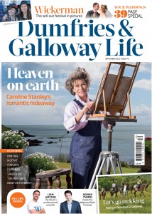
 I’m pretty chuffed with how the cover turned out. It works when either landscape or portrait photography is used and the structure manages to squeeze in lot of local faces without overpowering the main cover story.
Any particular inspirations from your past that have shaped you and your work?
My approach to magazine design comes from working at EMAP for four years. A lot of designers try to express themselves, rather than produce something that is right for the readers or client. At EMAP, you have to collaborate with editors and journalists. I realised you have to almost remove yourself from the process: design isn’t just fancy colouring in, it’s communicating and problem-solving.
 I was lucky enough to work with Andy Cowles at Rolling Stone and he reinforced the importance of bold, easily-understood design. He used type really clearly and constantly asked whether something was right for the readers. He’s also really good at talking about design and communicating with editors. Designers often get tangled up in the nuances of typography and unnecessary graphic ‘froth’.
When I moved to Scotland I worked with Ally Palmer and Terry Watson. They’re sticklers for good type and grid systems and have a beautiful nuanced way with type.
Been impressed recently by someone else’s work?
Marie Claire, is great – beautiful work but still reader-focussed. Paul McNamee’s Big Issue is world-class – intelligent, but not off-putting. ShortList and Stylist are consistently high-quality work. Hot Rum Cow is a lovely, quirky, personal magazine. Women’s Health has a million ideas in it. But Private Eye’s design is the best. Nobody can copy it, it’s totally unique and readers love it.


