EVER wondered the story behind a particular tale, or image or design?
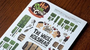
Among the recent magazine launches to have taken place in Scotland, few have generated as much intrigue when Edinburgh-based publishing agency, White Light Media, last year unveiled Hot Rum Cow, a lavishly-designed magazine, all about booze.
Priced at £5 and distributed primarily through London, it was something of a departure for a business best known for creating print and online magazines for banks, universities and businesses on its own doorstep.
Eric Campbell is the creative director at White Light Media. With the company for five years, he worked at The Scotsman, the Sydney Morning Herald, in Australia, and The Age, in Melbourne, also Australia. Before joining White Light Media, he was a freelance magazine designer.
Behind the Hot Rum Cow look, he answers the questions…
What exactly was the brief?
We specialise in publishing magazines for clients – magazines that help to influence their target audience, usually customers or employees.
White Light’s managing director, Fraser Allen, had always liked the idea of launching our own magazine – partly to practice what we preach, but also to create outstanding work that would turn heads and nudge us into fresh markets.
 We had five or six ideas for a magazine, but booze seemed the best avenue. There are loads of great food magazines out there, but very few dedicated to drinks – and those that exist are fairly dull and pretentious.
What first struck you about the job?
This project was literally a ‘blank canvas’. I knew what the style of writing was going to be like, and I knew what kind of look would suit the magazine, so creating a brand new publication from scratch was a task that I relished with bags of enthusiasm.
Describe the process from conception to completion
A lot of experimenting.
I did a lot of research into typography, looking at how different font families worked together and picking the best fit. I wanted to make sure that the magazine had a solid typographic core that would ensure a cohesive look from start to finish, but still have enough variety that would allow the design team to be creative with their layouts.
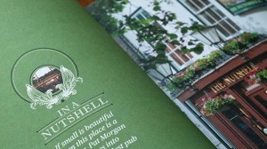
The visual direction was very important for us. We have constant battles with some clients who perceive an image-led feature as wasting space as there are not enough words on the page. I wanted to make sure that every commissioned shoot has a strong set of shots that don’t conform to a typical portrait of the subject looking at the camera with a big cheesy grin. Our commissioned photographers are encouraged to look for a different angle or location and to use their creativity instead of working to a heavily prescribed brief.
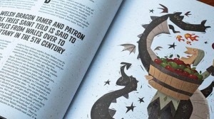
Illustration is a key part in the look of the magazine. Hot Rum Cow’s cover is dominated by the main feature, so we choose the illustrator carefully. They have to understand the way the magazine works and their style has to be in synch with the tone of the magazine and the feature they are illustrating.
The cover is our primary point of contact with the reader so it has to be eye-catching and quirky. We have been lucky with the first two issues as the illustrators we have collaborated with contributed bucket loads of passion and delivered really strong visuals.
 We keep the print run short – print is by far the biggest cost, so small is beautiful and, if the magazine is a cult title that is a little tricky to track down, so much the better as far as we are concerned.
Currently, 1,200 copies are distributed by Comag Specialist through upmarket magazine and design stores in London, including some great sites such as Harrods and Selfridges. It’s also available in high-end stores around the world from Hong Kong to New York. And we’re rapidly building a global subscription base (see www.hotrumcow.co.uk for details).
The digital team has worked hard to develop a strategy that fits with today’s modern mobile reader. The website complements the look of the magazine and is fully responsive to smartphones, tablets and desktop PCs.
Our emails that we send to subscribers follow the same model. We keep the website simple, uploading new content on a weekly basis and promoting it through our Twitter and Facebook accounts, along with additional content written and photographed by the team.
Pantone numbers, fonts, use of space, kit, etc?
Hot Rum Cow is a 100-page magazine, compact in size and printed on an uncoated stock. The core colours are taken from the masthead although the design isn’t just limited to those. The core font families are Commercial Type’s Publico and Font Smith’s Lola with Sudtipos’s Candy used as a display face. These were chosen because of their interesting features and the fact that they look good together on a page. Additional typefaces are used in features to add another dimension or highlight the topic being written about.
It is designed on Mac using Adobe InDesign and InCopy for editing. Adobe Photoshop and Illustrator are used for enhancing images and creating infographics.
What most excited you about the project and what pleases you the most about the finished article?
I loved being able to create the magazine from scratch knowing that I wasn’t constrained by boundaries. So, seeing that vision materialise in a beautifully-printed, fantastic-smelling, tactile 100-page magazine is an amazing feeling.
 Seeing the reaction it has had within the drinks industry has been fantastic, and we’ve also been attracting a secondary audience of what I would affectionately call ‘magazine geeks’ – people who love collecting beautifully-crafted magazines on all manner of topics.
Any particular inspirations from your past that have shaped you and your work?
I’ve always loved graphic design and Neville Brody was an obvious hero throughout my college years.
In my professional career, working with ex-Rolling Stone designer, Matthew Ball, on The Scotsman Magazine was a big influence on how I thought about the design of magazines.
Working with newspaper design consultants, Ally Palmer and Terry Watson, taught me a lot about structure and engaging page-creation.
Been impressed recently by someone else’s work?
I love Andrew Diprose’s work on Wired magazine, which has page-after-page of well thought-out, well designed and well illustrated features.
magCulture’s Jeremy Leslie included Hot Rum Cow in his ‘The Rise of Print’ exhibition alongside a magazine called Delayed Gratification. It has a similar ethos to us at Hot Rum Cow and promotes itself as the purveyor of slow journalism. It has an excellent mix of articles and illustration and a fine example of an independent magazine at the top of the class.
In the customer publishing sector, I recently came across a title called Completely London. It’s designed by Richard Murray and was a real stand-out.


