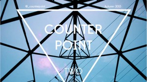
COUNTERPOINT is a quarterly online publication that was launched in Edinburgh, during the Summer. It aims “to combine the best of student features writing and illustration in an accessible, innovative format”. The second issue came out on Monday.
The journal’s editor, Sam Bradley, a student at the University of Edinburgh, answers the questions…
What exactly was the brief?
Counterpoint is a themed quarterly publication, and so the main challenge with this second issue was to find a theme that both our contributors and our audience could engage with. I think that we’ve managed to do that with this release.
What first struck you about the job?
 The quality of both the writing and the illustrations we’ve been able to publish. I’ve been incredibly pleased with the way our contributors – who are all excellent writers and illustrators in their own right – have responded to working with us. There’s a lot of brilliant work out there being done by students and we’ve been lucky to tap some of the best of it.
Describe the process from conception to completion
Our only regular staff are myself and art director, Bethany Thompson. The starting point for each issue has been the theme; we need something that can be engaged with easily but that is also challenging. From that point onwards, we try to generate article ideas, although articles are something of a collaborative process: most of this issue’s pieces were built from ideas that came from our writers themselves rather than us.
When we’ve got our words, we go to our illustrators and have them respond to the articles in turn.
Pantone numbers, fonts, use of space, kit, etc?
Everything we do at Counterpoint is digital; we design each issue on Adobe InDesign and sourced our main font, Edmonsans, from the Lost Type Co-op (an online typeface foundry). Each article is colour-coded with a key-colour, but overall we try and keep to a pared-back, minimalist style. Of course, each of the illustrators have their own methods in their practice. In terms of distribution and publicity, we rely mainly on WordPress and Issuu as well as the usual social media suspects.
To date, Counterpoint hasn’t cost a penny to produce, and we use free tools throughout the process.
What most excited you about the project and what pleases you the most about the finished article?
 What most excited both of us about the project was the chance to build something new, something a little more niche that isn’t currently available within regular student media, and the chance to champion the work of people we admire. What pleases me the most, apart from seeing the publication all finished on the screen, is when people engage and interact with it.
Any particular inspirations from your past that have shaped you and your work?
We’ve both worked in a variety of formats before, from student newspapers, online e-zines, printed art-zines and blogging, and to an extent Counterpoint takes something from each of those formats and combines it, ideally in a high-end finished product.
Been impressed recently by someone else’s work?
We’re both jealous of the guys behind Oh, Comely and architecture/design journal, The Modernist. I like White Coffee, an online film magazine too.


